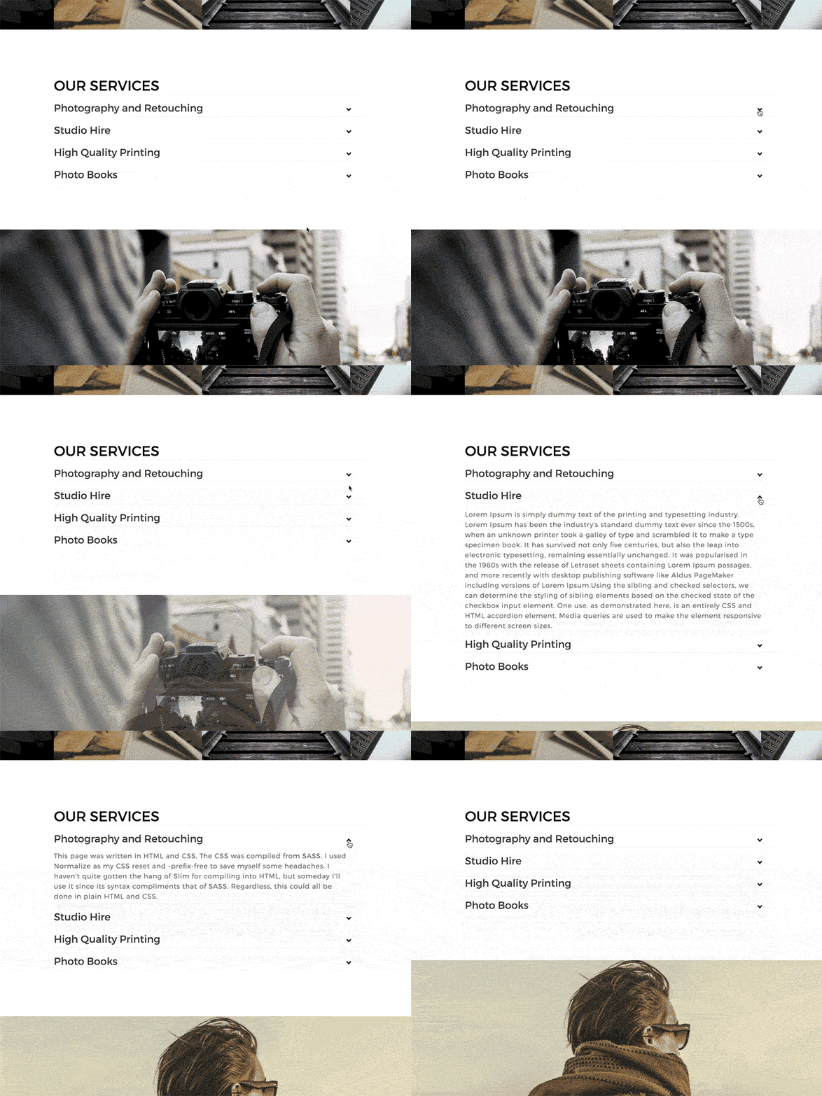
SmugMug offers great customization blocks out of the box, but sometimes you might want to add some interactive elements to your site. In this tutorial, I will walk you through the process of adding a simple accordion block to your SmugMug website using HTML and CSS.

What is an Accordion Block?
An accordion block is a vertically stacked list of items, each of which can be expanded or collapsed to reveal or hide content. This is a great way to organize information in a compact format, allowing visitors to your site to easily find and access the content they’re interested in.
HTML code
Add an HTML content block to a page where you would like to add this panel to. And then add this code to it:
<!-- ACCORDION PANEL FOR YOUR SMUGMUG SITE BY TOMASZ NOWICKI - HTTPS://CUSTOMSMUG.COM -->
<!-- TITLE OF YOUR PANEL -->
<h1>OUR SERVICES</h1>
<ul>


    <!-- FIRST SECTION -->
  <li>
    <input type="checkbox" checked>
    <i></i>
      <!-- TITLE OF YOUR FIRST SECTION -->
    <h2>Photography and Retouching</h2>
      <!-- PARAGRAPH OF YOUR FIRST SECTION -->
    <p>This page was written in HTML and CSS. The CSS was compiled from SASS. I used Normalize as my CSS reset and -prefix-free to save myself some headaches. I haven't quite gotten the hang of Slim for compiling into HTML, but someday I'll use it since its syntax compliments that of SASS. Regardless, this could all be done in plain HTML and CSS.</p>
  </li>


    <!-- SECOND SECTION -->
  <li>
    <input type="checkbox" checked>
    <i></i>
      <!-- TITLE OF YOUR SECOND SECTION -->
    <h2>Studio Hire</h2>
      <!-- PARAGRAPH OF YOUR SECOND SECTION -->
    <p>Lorem Ipsum is simply dummy text of the printing and typesetting industry. Lorem Ipsum has been the industry's standard dummy text ever since the 1500s, when an unknown printer took a galley of type and scrambled it to make a type specimen book. <br><br>It has survived not only five centuries, but also the leap into electronic typesetting, remaining essentially unchanged. It was popularised in the 1960s with the release of Letraset sheets containing Lorem Ipsum passages, and more recently with desktop publishing software like Aldus PageMaker including versions of Lorem Ipsum.Using the sibling and checked selectors, we can determine the styling of sibling elements based on the checked state of the checkbox input element.<br><br> One use, as demonstrated here, is an entirely CSS and HTML accordion element. Media queries are used to make the element responsive to different screen sizes.</p>
  </li>


    <!-- THIRD SECTION -->
  <li>
    <input type="checkbox" checked>
    <i></i>
      <!-- TITLE OF YOUR THIRD SECTION -->
    <h2>High Quality Printing</h2>
      <!-- PARAGRAPH OF YOUR THIRD SECTION -->
    <p>By making the open state default for when :checked isn't detected, we can make this system accessable for browsers that don't recognize :checked. The fallback is simply an open accordion. The accordion can be manipulated with Javascript (if needed) by changing the "checked" property of the input element.</p>
  </li>


    <!-- FOURTH SECTION -->
   <li>
    <input type="checkbox" checked>
    <i></i>
       <!-- TITLE OF YOUR FOURTH SECTION -->
    <h2>Photo Books</h2>
       <!-- PARAGRAPH OF YOUR FOURTH SECTION -->
    <p>By making the open state default for when :checked isn't detected, we can make this system accessable for browsers that don't recognize :checked. The fallback is simply an open accordion. The accordion can be manipulated with Javascript (if needed) by changing the "checked" property of the input element.</p>
  </li>


</ul>
<!-- END OF ACCORDION CODE -->
Information
The HTML section is the section where you will add all of the text, which will appear in your panel. Here are a few tips if you are not familiar with HTML code:
Everything between <h1> MY TITLE </h1>will be the header/title of your panel – in my case it is OUR SERVICES.
Everything between <h2>MY SECTION </h2> will be the title of each section of your panel – in my case they are PHOTOGRAPHY AND RETOUCHING, STUDIO HIRE, HIGH QUALITY PRINTS and PHOTO BOOKS.
Everything between <p>My text</p> will be the paragraph that appears in each section of the panel.
To make this even clearer, I have made notes for each section in the HTML code.
CSS code
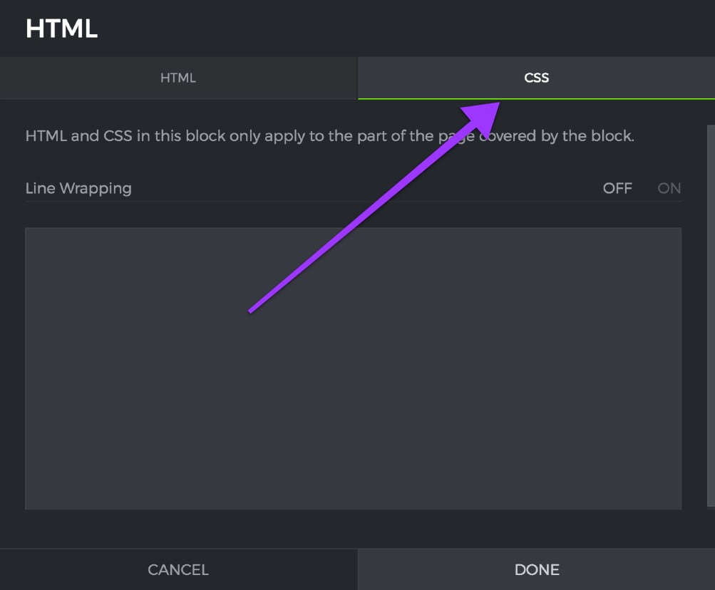
At the moment, the whole panel does not look as on my demo – this is because you have not added the CSS code to the same HTML content block { CSS TAB }:

You will need to copy and paste this code to the CSS tab of your HTML content block. It may look very complicated at first – but do not worry, you only need to think about one section of this code, which I will explain later:
/*CSS CODE FOR THE ACCORDION PANEL - HTTPS://PORTAL.PHOTOM.ME*/
.transition, p, ul li i:before, ul li i:after {
  transition: all 0.25s ease-in-out;
}
.flipIn, h1, ul li {
  animation: flipdown 0.5s ease both;
}
.no-select, h2 {
  -webkit-tap-highlight-color: transparent;
  -webkit-touch-callout: none;
  -webkit-user-select: none;
  -khtml-user-select: none;
  -moz-user-select: none;
  -ms-user-select: none;
  user-select: none;
}
html {
  width: 100%;
  height: 100%;
  perspective: 900;
  overflow-y: scroll;
  background-color: transparent;
}
body {
  min-height: 0;
  display: inline-block;
  position: relative;
  left: 50%;
  margin: 90px 0;
  transform: translate(-50%, 0);
  padding: 30px;
}
@media (max-width: 550px) {
  body {
    box-sizing: border-box;
    transform: translate(0, 0);
    max-width: 100%;
    min-height: 100%;
    margin: 0;
    left: 0;
  }
}
h1 {
  text-transform: uppercase;
  font-size: 36px;
  line-height: 42px;
  letter-spacing: 0px;
  font-weight: 100;
  color: black;
  padding-top: 8px;
  border-top: 6px solid #000;
}
h2 {
  font-size: 26px;
  line-height: 34px;
  font-weight: 300;
  letter-spacing: 0px;
  display: block;
  margin: 0;
  cursor: pointer;
  color: #404040;
}
p {
  color: #666;
  font-size: 17px;
  line-height: 26px;
  letter-spacing: 1px;
  position: relative;
  overflow: hidden;
  max-height: 800px;
  opacity: 1;
  transform: translate(0, 0);
  margin-top: 14px;
  z-index: 2;
}
ul {
  list-style: none;
  perspective: 900;
  padding: 0;
  margin: 0;
}
ul li {
  position: relative;
  padding: 0;
  margin: 0;
  padding-bottom: 4px;
  padding-top: 18px;
  border-top: 1px dotted #dce7eb;
}
/******IMPORTANT! THIS SECTION WILL NEED TO BE CHANGED DEPENDING ON HOW MANY SECTIONS YOU HAVE IN YOUR PANEL******/
ul li:nth-of-type(1) {
  animation-delay: 0.5s;
}
ul li:nth-of-type(2) {
  animation-delay: 0.75s;
}
ul li:nth-of-type(3) {
  animation-delay: 1s;
}
ul li:nth-of-type(4) {
  animation-delay: 1.25s;
}
/******END OF THE IMPORTANT SECTION******/
ul li:last-of-type {
  padding-bottom: 0;
}
ul li i {
  position: absolute;
  transform: translate(-6px, 0);
  margin-top: 16px;
  right: 0;
}
ul li i:before, ul li i:after {
  content: "";
  position: absolute;
  background-color: #000;
  width: 3px;
  height: 9px;
}
ul li i:before {
  transform: translate(-2px, 0) rotate(45deg);
}
ul li i:after {
  transform: translate(2px, 0) rotate(-45deg);
}
ul li input[type=checkbox] {
  position: absolute;
  cursor: pointer;
  width: 100%;
  height: 100%;
  z-index: 1;
  opacity: 0;
}
ul li input[type=checkbox]:checked ~ p {
  margin-top: 0;
  max-height: 0;
  opacity: 0;
  transform: translate(0, 50%);
}
ul li input[type=checkbox]:checked ~ i:before {
  transform: translate(2px, 0) rotate(45deg);
}
ul li input[type=checkbox]:checked ~ i:after {
  transform: translate(-2px, 0) rotate(-45deg);
}
@keyframes flipdown {
  0% {
    opacity: 0;
    transform-origin: top center;
    transform: rotateX(-90deg);
  }
  5% {
    opacity: 1;
  }
  80% {
    transform: rotateX(8deg);
  }
  83% {
    transform: rotateX(6deg);
  }
  92% {
    transform: rotateX(-3deg);
  }
  100% {
    transform-origin: top center;
    transform: rotateX(0deg);
  }
}
After adding the code you will see that everything looks exactly the same as in my demo. I know the fonts may look different from my demo – but this is because you are probably using a different theme on your site.
Adding or removing additional sections
Adding or removing sections from the panel is easy because you just need to tweak the HTML and CSS a little bit:
HTML changes
In the HTML code you need to copy the last section – in this case, it will be the FOURTH SECTION and paste it below the closing li tag:
<!-- FOURTH SECTION -->
   <li>
    <input type="checkbox" checked>
    <i></i>
       <!-- TITLE OF YOUR FOURTH SECTION -->
    <h2>Photo Books</h2>
       <!-- PARAGRAPH OF YOUR FOURTH SECTION -->
    <p>By making the open state default for when :checked isn't detected, we can make this system accessable for browsers that don't recognize :checked. The fallback is simply an open accordion. The accordion can be manipulated with Javascript (if needed) by changing the "checked" property of the input element.</p>
  </li>
Of course, you have to replace the SECTION TITLE and the SECTION PARAGRAPH with the new content that you would like to appear in this new section.
If you would like to remove any of these sections – just delete that section from the code.
CSS changes
The CSS code for this panel is quite long – this is because it uses some code to animate the panel. But I want you to find this section in the CSS code { CSS TAB of the HTML content block }:
/******IMPORTANT! THIS SECTION WILL NEED TO BE CHANGED DEPENDING ON HOW MANY SECTIONS YOU HAVE IN YOUR PANEL******/
ul li:nth-of-type(1) {
  animation-delay: 0.5s;
}
ul li:nth-of-type(2) {
  animation-delay: 0.75s;
}
ul li:nth-of-type(3) {
  animation-delay: 1s;
}
ul li:nth-of-type(4) {
  animation-delay: 1.25s;
}
/******END OF THE IMPORTANT SECTION******/
This is the only part of the CSS code that you are interested in. This part of the code is responsible for animating each of the sections of the panel one after another. Since we have 4 sections in my demo – I have four sections in the code.
So if I would add a fifth section to my panel – I would need to copy the last part of the code:
ul li:nth-of-type(4) {
  animation-delay: 1.25s;
}
And change the number at the end to 5 and add 0.25 s to the delay of my animation so the finish code should look like this:
/******IMPORTANT! THIS SECTION WILL NEED TO BE CHANGED DEPENDING ON HOW MANY SECTIONS YOU HAVE IN YOUR PANEL******/
ul li:nth-of-type(1) {
  animation-delay: 0.5s;
}
ul li:nth-of-type(2) {
  animation-delay: 0.75s;
}
ul li:nth-of-type(3) {
  animation-delay: 1s;
}
ul li:nth-of-type(4) {
  animation-delay: 1.25s;
}
ul li:nth-of-type(5) {
  animation-delay: 1.50s;
}
/******END OF THE IMPORTANT SECTION******/
Of course, if you want to have fewer sections – just remove each line of code that you do not need. For example, you have only three panels – the code would then look like this:
/******IMPORTANT! THIS SECTION WILL NEED TO BE CHANGED DEPENDING ON HOW MANY SECTIONS YOU HAVE IN YOUR PANEL******/
ul li:nth-of-type(1) {
  animation-delay: 0.5s;
}
ul li:nth-of-type(2) {
  animation-delay: 0.75s;
}
ul li:nth-of-type(3) {
  animation-delay: 1s;
}
/******END OF THE IMPORTANT SECTION******/