
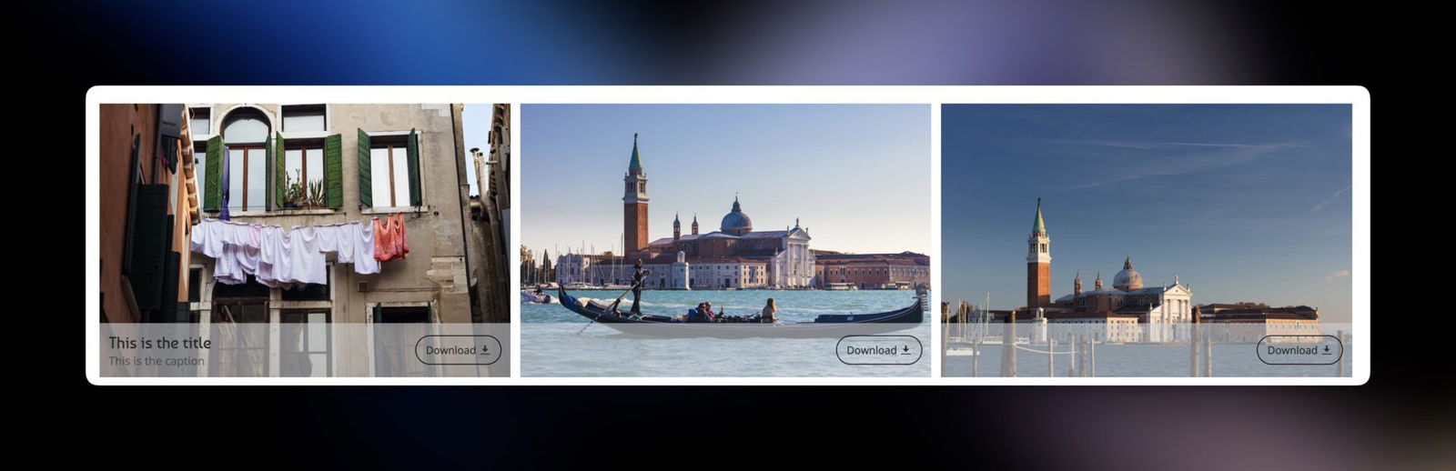
Have you ever wanted to make your SmugMug download buttons that appears over gallery thumbnails more prominent and user-friendly? By default, SmugMug’s download buttons only show a small icon without any text label, which can sometimes confuse visitors who might not immediately recognize what the button does.
In this tutorial, I’ll show you how to add a clear “Download” text label and a stylish rounded border to your download buttons using simple CSS code. This customization will make your download buttons more obvious and visually appealing to your website visitors.
What You’ll Learn
By the end of this tutorial, your download button will have:
- A clear “Download” text label next to the icon
- A white rounded border around the entire button
- A smooth hover effect that makes the button feel interactive
Before We Start
This tutorial uses CSS code, which might look intimidating if you’ve never used it before. Don’t worry! CSS is like giving instructions to your website about how things should look. Think of it as telling your website: “Make this button have a white border” or “Add the word ‘Download’ before the icon.”
You don’t need to understand every single line of code – just follow the steps, and everything will work perfectly.
Step 1: Find Where to Add the Code
First, you need to decide where to apply this customization:
- For all galleries: Add the code to the ENTIRE SITE section
- For specific galleries: Add the code to individual galleries
To add the code:
- Log in to your SmugMug account
- Go to Customize → CSS Content Block
- Click Add to create a new CSS content block
Step 2: Add the CSS Code
Copy and paste this code into your CSS content block:
/* Add "Download" text and rounded border to SmugMug download button */
.sm-button-image-download {
    border: 1px solid white !important; /* White rounded border */
    border-radius: 20px !important; /* More rounded corners */
    padding: 8px 12px !important; /* Add padding for better spacing */
    transition: all 0.3s ease !important; /* Smooth transition for all properties */
}

/* Add "Download" text before the icon */
.sm-button-image-download::before {
    margin-right: 4px; /* Adjusting space between the button and the icon */
    content: "Download";
    font-size: 13px; /* Adjust font size as needed */
    color: inherit; /* Use the same color as the button */
}

/* Optional: Adjust the icon size if needed */
.sm-button-image-download .sm-fonticon {
    flex-shrink: 0; /* Prevent icon from shrinking */
}

/* Optional: Hover effect for better user experience */
.sm-button-image-download:hover {
    background-color: rgba(0, 0, 0, 0.1) !important;
    border-color: #555 !important;
    transform: translateY(-2px) !important; /* Subtle lift effect */
}
Step 3: Understanding What the Code Does
Let me break down what each part of the code does in simple terms:
The Main Button Styling
.sm-button-image-download {
    border: 1px solid white !important;
    border-radius: 20px !important;
    padding: 8px 12px !important;
    transition: all 0.3s ease !important;
}
border: 1px solid white– Creates a thin white border around the buttonborder-radius: 20px– Makes the corners rounded (higher numbers = more rounded)padding: 8px 12px– Adds space inside the button so it’s not crampedtransition: all 0.3s ease– Makes any changes to the button happen smoothly over 0.3 seconds
Adding the “Download” Text
.sm-button-image-download::before {
    margin-right: 4px;
    content: "Download";
    font-size: 13px;
    color: inherit;
}
content: "Download"– This is where the magic happens! This adds the word “Download” before the iconmargin-right: 4px– Creates a small gap between the text and the iconfont-size: 13px– Controls how big the text appearscolor: inherit– Makes the text the same color as the rest of the button
The Hover Effect
.sm-button-image-download:hover {
    background-color: rgba(0, 0, 0, 0.1) !important;
    border-color: #555 !important;
    transform: translateY(-2px) !important;
}
This section creates a nice effect when someone hovers their mouse over the button:
- The background becomes slightly darker
- The border changes to a gray color
- The button “lifts” up by 2 pixels, making it feel interactive
Step 4: Customize the Code (Optional)
Want to make some adjustments? Here are the most common customizations:
Change the Text Label
Replace "Download" with any text you prefer:
content: "Get Photos";or
content: "Save Image";Change the Border Color
Replace white with any color you like:
border: 1px solid blue !important;or
border: 1px solid #ff6b6b !important;Make the Corners More or Less Rounded
Change the 20px value:
10px= slightly rounded30px= very rounded50px= completely round ends
Adjust the Text Size
Change the 13px value to make the text bigger or smaller:
font-size: 16px; /* Bigger text */or
font-size: 11px; /* Smaller text */Step 5: Test Your Button
After adding the code:
- Click Save on your CSS content block
- Publish your changes
- Visit your gallery and look for the download button
- Try hovering over it to see the smooth animation effect
Troubleshooting
The button doesn’t look different: Make sure you’ve published your changes and cleared your browser cache (try refreshing the page with Ctrl+F5 on Windows or Cmd+Shift+R on Mac).
The text appears but looks weird: Check that you’ve copied the entire code correctly, including all the brackets and semicolons.
The hover effect doesn’t work: This is usually a copy-paste issue. Double-check that the hover section of the code is included.
Why This Works
SmugMug’s download buttons have a specific class name (sm-button-image-download) that we can target with CSS. By using CSS pseudo-elements (the ::before part), we can add content that wasn’t originally there. The !important declarations ensure our styling takes priority over SmugMug’s default styles.
Final Thoughts
This simple customization can make a big difference in user experience. Your visitors will immediately understand what the button does, and the polished styling makes your site look more professional.
Remember, if you want to remove this customization later, simply delete the CSS code from your content block and publish the changes.