You have added to your SmugMug website a full-screen slideshow or full-screen image background and you wonder ‘why parts of the images are cropped out?’
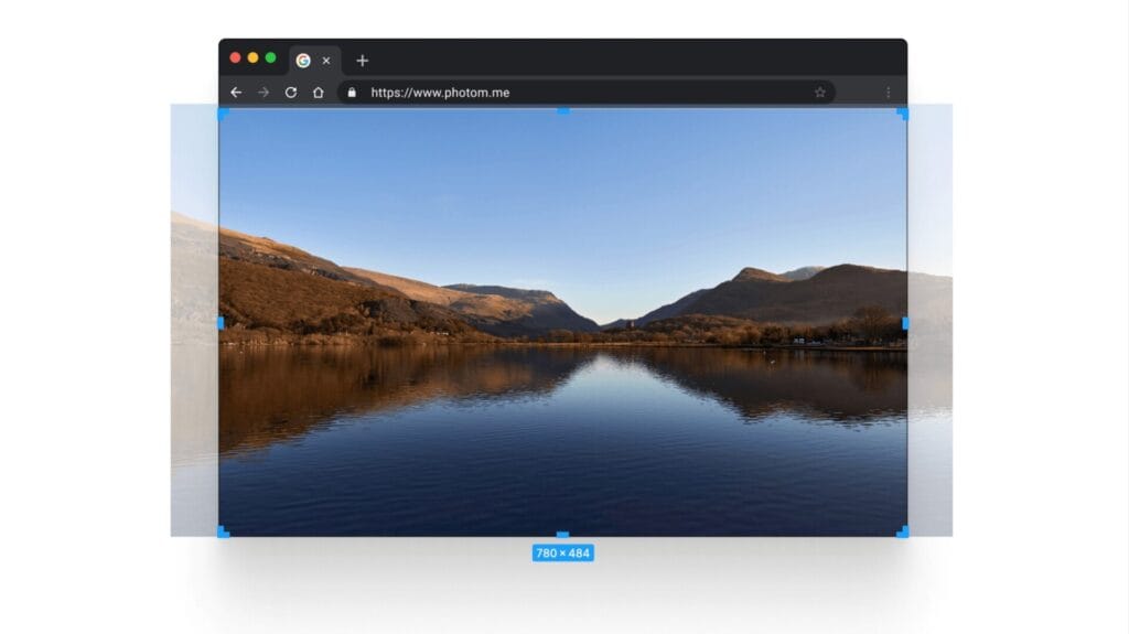
The reason for this is that the images have to fill the whole screen, no matter the aspect ratio of your viewing screen – see my screenshot:

As you can see on my screenshot – in order for my image to fill the web browser window, sides of the images have to be cropped out.
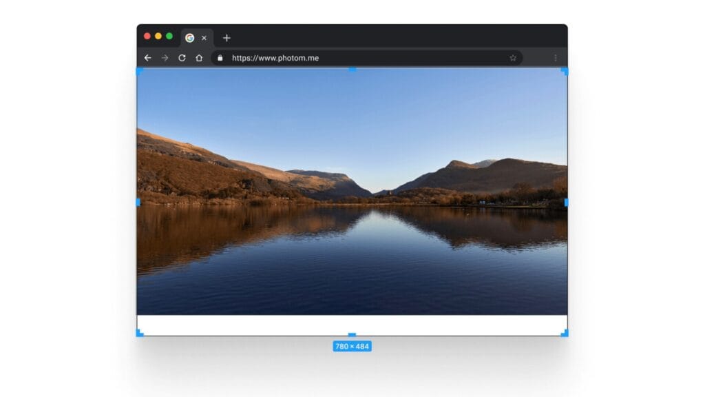
This is how the image would look, if the automatic cropping was not applied to your full-screen background:

As you can see – the image would not cover the whole screen, because the aspect ratio of the web browser window would not match the aspect ratio of my photo.
Tip
So how can I make my photos look good in the full-screen slideshow, full-screen image background?
- don’t use vertical/portrait images;
- use horizontal/landscape images;
- use images, where the main subject is not near the edges of the photo – so it does not get cropped off on some screen sizes.
Don’t like the full screen slideshow? Try using the Slideshow or Carousel content blocks instead.
