How to Add an Accordion Block to Your SmugMug Site
Learn how to create an interactive accordion panel for your SmugMug site using HTML and CSS. Perfect for FAQs, service lists, and organizing content.
SmugMug offers great content blocks out of the box, but sometimes you need interactive elements to organize information more effectively. In this tutorial, you'll learn how to add a collapsible accordion panel to your SmugMug site using pure HTML and CSS — no JavaScript required.
What is an accordion?
An accordion is a vertically stacked list of items that can be expanded or collapsed to reveal or hide content. It's perfect for:
- FAQs — Let visitors find answers without scrolling through walls of text
- Service lists — Showcase your photography packages with expandable details
- Pricing information — Keep your page clean while providing detailed breakdowns
- Session information — Explain what clients can expect during different types of shoots
Prerequisites
Before starting, make sure you have:
- Access to your SmugMug site's customization panel
- A SmugMug plan that supports HTML content blocks (Power or Portfolio)
Add the HTML code
Open your SmugMug customization panel
Navigate to your SmugMug site, click Customize, and go to the page where you want to add the accordion.
Add an HTML content block
Click Add Content and select Text or HTML block. This is where your accordion code will live.
Paste the HTML code
Switch to HTML/Source mode in your content block and paste the following code:
<!-- ACCORDION PANEL FOR SMUGMUG BY CUSTOMSMUG.COM -->
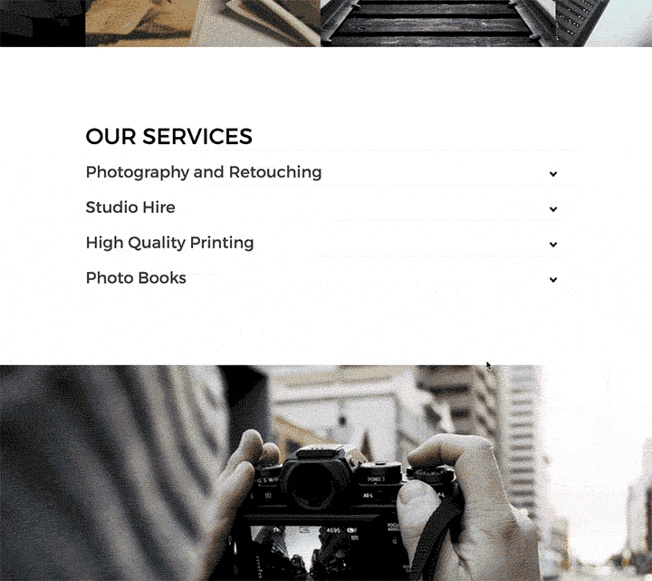
<h1>Our Services</h1>
<ul>
<!-- FIRST SECTION -->
<li>
<input type="checkbox" checked>
<i></i>
<h2>Portrait Sessions</h2>
<p>Professional portrait photography for individuals, couples, and families. Each session includes a pre-shoot consultation, 1-2 hours of shooting time, and a private online gallery with 30+ edited images to choose from.</p>
</li>
<!-- SECOND SECTION -->
<li>
<input type="checkbox" checked>
<i></i>
<h2>Wedding Photography</h2>
<p>Full-day coverage of your special moment, from preparation to the last dance. Includes a second photographer, engagement session, and a beautifully designed photo album. Packages start at 8 hours of coverage.</p>
</li>
<!-- THIRD SECTION -->
<li>
<input type="checkbox" checked>
<i></i>
<h2>Commercial Work</h2>
<p>Professional imagery for your business needs including product photography, corporate headshots, and brand storytelling. Licensed for commercial use with quick turnaround times available.</p>
</li>
<!-- FOURTH SECTION -->
<li>
<input type="checkbox" checked>
<i></i>
<h2>Print Services</h2>
<p>Museum-quality prints on archival paper, canvas wraps, and metal prints. All prints are produced by professional labs and come with a satisfaction guarantee. Sizes range from 8x10 to large format wall art.</p>
</li>
</ul>
<!-- END OF ACCORDION CODE -->Understanding the HTML structure: Each accordion section is wrapped in an <li> tag containing a hidden checkbox (which controls the open/close state), an <i> tag (for the arrow icon), an <h2> for the title, and a <p> for the content.
Add the CSS code
The HTML alone won't look like an accordion yet — you need to add the CSS that handles the styling and animations.
Open the CSS tab
In your HTML content block, switch to the CSS tab (not the main SmugMug CSS editor).
Paste the CSS code
Copy and paste the following CSS code:
/* ACCORDION PANEL CSS - CUSTOMSMUG.COM */

/* Transitions and animations */
.transition, p, ul li i:before, ul li i:after {
  transition: all 0.25s ease-in-out;
}

.flipIn, h1, ul li {
  animation: flipdown 0.5s ease both;
}

.no-select, h2 {
  -webkit-tap-highlight-color: transparent;
  -webkit-touch-callout: none;
  -webkit-user-select: none;
  -moz-user-select: none;
  -ms-user-select: none;
  user-select: none;
}

/* Base styles */
html {
  width: 100%;
  height: 100%;
  perspective: 900;
  overflow-y: scroll;
  background-color: transparent;
}

body {
  min-height: 0;
  display: inline-block;
  position: relative;
  left: 50%;
  margin: 90px 0;
  transform: translate(-50%, 0);
  padding: 30px;
}

@media (max-width: 550px) {
  body {
    box-sizing: border-box;
    transform: translate(0, 0);
    max-width: 100%;
    min-height: 100%;
    margin: 0;
    left: 0;
  }
}

/* Typography */
h1 {
  text-transform: uppercase;
  font-size: 36px;
  line-height: 42px;
  letter-spacing: 0px;
  font-weight: 100;
  color: black;
  padding-top: 8px;
  border-top: 6px solid #000;
}

h2 {
  font-size: 26px;
  line-height: 34px;
  font-weight: 300;
  letter-spacing: 0px;
  display: block;
  margin: 0;
  cursor: pointer;
  color: #404040;
}

p {
  color: #666;
  font-size: 17px;
  line-height: 26px;
  letter-spacing: 1px;
  position: relative;
  overflow: hidden;
  max-height: 800px;
  opacity: 1;
  transform: translate(0, 0);
  margin-top: 14px;
  z-index: 2;
}

/* List structure */
ul {
  list-style: none;
  perspective: 900;
  padding: 0;
  margin: 0;
}

ul li {
  position: relative;
  padding: 0;
  margin: 0;
  padding-bottom: 4px;
  padding-top: 18px;
  border-top: 1px dotted #dce7eb;
}

/* Animation delays for each section */
ul li:nth-of-type(1) { animation-delay: 0.5s; }
ul li:nth-of-type(2) { animation-delay: 0.75s; }
ul li:nth-of-type(3) { animation-delay: 1s; }
ul li:nth-of-type(4) { animation-delay: 1.25s; }

ul li:last-of-type {
  padding-bottom: 0;
}

/* Arrow icon */
ul li i {
  position: absolute;
  transform: translate(-6px, 0);
  margin-top: 16px;
  right: 0;
}

ul li i:before, ul li i:after {
  content: "";
  position: absolute;
  background-color: #000;
  width: 3px;
  height: 9px;
}

ul li i:before {
  transform: translate(-2px, 0) rotate(45deg);
}

ul li i:after {
  transform: translate(2px, 0) rotate(-45deg);
}

/* Checkbox interaction */
ul li input[type=checkbox] {
  position: absolute;
  cursor: pointer;
  width: 100%;
  height: 100%;
  z-index: 1;
  opacity: 0;
}

ul li input[type=checkbox]:checked ~ p {
  margin-top: 0;
  max-height: 0;
  opacity: 0;
  transform: translate(0, 50%);
}

ul li input[type=checkbox]:checked ~ i:before {
  transform: translate(2px, 0) rotate(45deg);
}

ul li input[type=checkbox]:checked ~ i:after {
  transform: translate(-2px, 0) rotate(-45deg);
}

/* Flip animation keyframes */
@keyframes flipdown {
  0% {
    opacity: 0;
    transform-origin: top center;
    transform: rotateX(-90deg);
  }
  5% {
    opacity: 1;
  }
  80% {
    transform: rotateX(8deg);
  }
  83% {
    transform: rotateX(6deg);
  }
  92% {
    transform: rotateX(-3deg);
  }
  100% {
    transform-origin: top center;
    transform: rotateX(0deg);
  }
}
Save and preview
Click Save and preview your page. The accordion should now be fully functional with smooth animations.
Make sure you paste the CSS into the CSS tab of your HTML content block, not into SmugMug's main custom CSS section. The accordion styles target generic HTML elements and could conflict with your site theme if placed globally.
Customizing your accordion
Adding more sections
To add a fifth section (or more), copy one of the existing <li> blocks and paste it before the closing </ul> tag:
<!-- FIFTH SECTION -->
<li>
  <input type="checkbox" checked>
  <i></i>
  <h2>Your New Section Title</h2>
  <p>Your section content goes here.</p>
</li>
Then add a corresponding animation delay in the CSS. Find the animation delays section and add a new line:
ul li:nth-of-type(1) { animation-delay: 0.5s; }
ul li:nth-of-type(2) { animation-delay: 0.75s; }
ul li:nth-of-type(3) { animation-delay: 1s; }
ul li:nth-of-type(4) { animation-delay: 1.25s; }
ul li:nth-of-type(5) { animation-delay: 1.5s; }  /* Add this line */
Each section adds 0.25 seconds to the animation delay. This creates the cascading effect when the accordion first loads on the page.
Removing sections
To remove a section:
- Delete the entire
<li>...</li>block from the HTML - Remove the corresponding
ul li:nth-of-type(X)line from the CSS
For example, if you only need 3 sections, your animation delays should be:
ul li:nth-of-type(1) { animation-delay: 0.5s; }
ul li:nth-of-type(2) { animation-delay: 0.75s; }
ul li:nth-of-type(3) { animation-delay: 1s; }
Styling options
Change the header color
Find the h1 section in the CSS and modify the color and border-top properties:
h1 {
  color: #1a1a1a;           /* Header text color */
  border-top: 6px solid #d4a853;  /* Gold accent line */
}
Change section title colors
Modify the h2 section:
h2 {
  color: #2c3e50;  /* Darker blue-gray */
}
Change the paragraph text
Modify the p section:
p {
  color: #555;     /* Text color */
  font-size: 16px; /* Slightly smaller */
  line-height: 28px; /* More breathing room */
}
Change the arrow color
Find the ul li i:before, ul li i:after section:
ul li i:before, ul li i:after {
  background-color: #d4a853;  /* Gold arrows */
}
Change the section divider
Modify the ul li border:
ul li {
  border-top: 1px solid #e0e0e0;  /* Solid line instead of dotted */
}
Troubleshooting
Accordion doesn't animate
- Ensure the CSS is in the CSS tab of your HTML content block
- Check that you haven't accidentally removed the
@keyframes flipdownsection
Sections won't open or close
- Verify each
<li>contains an<input type="checkbox" checked>element - Make sure the checkbox CSS rules are present
Styling looks wrong or conflicts with theme
- The CSS targets generic elements (h1, h2, p, ul, li). If conflicts occur, you may need to wrap everything in a container and scope the styles
- Try adding a unique class to the parent ul:
<ul class="custom-accordion">and prefix all CSS selectors with.custom-accordion
Animation delays don't match number of sections
- Count your
<li>sections and ensure you have a matching number oful li:nth-of-type(X)rules in the CSS
Text is cut off when expanded
- Increase the
max-heightvalue in thepstyles (currently set to 800px)