How to Add a Label and Border to SmugMug's Download Button
Make SmugMug's download button more visible by adding a "Download" text label, rounded border, and hover effects using CSS.
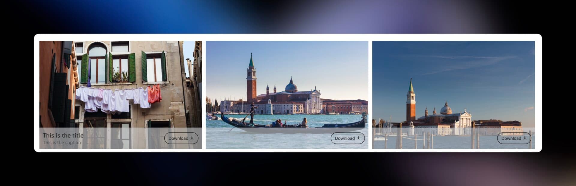
SmugMug's download button shows only a small icon by default, which visitors might not immediately recognize. This tutorial shows you how to make the download button more prominent with a text label, stylish border, and smooth hover effect.
What you'll create
- A clear "Download" text label next to the icon
- A rounded border around the button
- A smooth hover animation for interactivity
Open the CSS editor
Navigate to Customize → Entire Site (or a specific gallery) and add a CSS content block.
Add the CSS code
Paste the following code:
/* Style the download button */
.sm-button-image-download {
    border: 1px solid white !important;
    border-radius: 20px !important;
    padding: 8px 12px !important;
    transition: all 0.3s ease !important;
}

/* Add "Download" text before the icon */
.sm-button-image-download::before {
    content: "Download";
    margin-right: 4px;
    font-size: 13px;
    color: inherit;
}

/* Prevent icon from shrinking */
.sm-button-image-download .sm-fonticon {
    flex-shrink: 0;
}

/* Hover effect */
.sm-button-image-download:hover {
    background-color: rgba(0, 0, 0, 0.1) !important;
    border-color: #555 !important;
    transform: translateY(-2px) !important;
}
Publish and test
Save your changes, publish, and hover over the download button to see the animation.
How it works
Button styling
.sm-button-image-download {
    border: 1px solid white !important;
    border-radius: 20px !important;
    padding: 8px 12px !important;
    transition: all 0.3s ease !important;
}border— Creates a visible border around the buttonborder-radius— Rounds the corners (higher values = more rounded)padding— Adds space inside the buttontransition— Makes changes animate smoothly
Adding the label
.sm-button-image-download::before {
    content: "Download";
    margin-right: 4px;
    font-size: 13px;
    color: inherit;
}
The ::before pseudo-element inserts text before the icon. The content property defines what text appears.
Hover animation
.sm-button-image-download:hover {
    background-color: rgba(0, 0, 0, 0.1) !important;
    border-color: #555 !important;
    transform: translateY(-2px) !important;
}
When visitors hover over the button:
- Background becomes slightly darker
- Border changes to gray
- Button lifts up by 2 pixels
Customization options
Change the label text
content: "Save Image";
content: "Get Photo";
content: "Free Download";
Change the border color
border: 1px solid #0066cc !important; /* Blue */
border: 1px solid #ff6b6b !important; /* Red */
border: 2px solid white !important;   /* Thicker border */
Adjust corner roundness
border-radius: 5px !important;  /* Slightly rounded */
border-radius: 50px !important; /* Pill shape */
border-radius: 0 !important;    /* Square corners */
Change text size
font-size: 11px; /* Smaller */
font-size: 16px; /* Larger */
Different hover color
.sm-button-image-download:hover {
    background-color: rgba(255, 255, 255, 0.2) !important; /* Light overlay */
    border-color: white !important;
}
Troubleshooting
Button doesn't look different
- Clear your browser cache (Ctrl+F5 on Windows, Cmd+Shift+R on Mac)
- Make sure you published your changes
Text appears but looks wrong
- Check that you copied the entire code including all brackets and semicolons
Hover effect doesn't work
- Ensure the hover section is included in your CSS
The !important declarations ensure your styles override SmugMug's defaults. While generally avoided in CSS, they're necessary here for customization to work.