How to Style the Mobile Menu on SmugMug
Customize the mobile menu button appearance including making the background transparent and repositioning the footer on mobile devices.
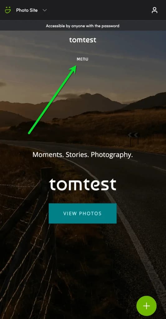
SmugMug's mobile menu button has a solid background by default, which may not match your design aesthetic — especially if you're using a full-screen background image or slideshow. Here's how to customize it.
Transparent menu button background
Make the mobile menu button blend seamlessly with your background:
/* Transparent background on mobile menu button */
.sm-user-ui .sm-page-widget-nav-mobile .sm-page-widget-nav-mobile-header {
    background-color: transparent;
}
Move footer to bottom on mobile
When using a full-screen background slideshow or image without content below the navigation, the SmugMug footer can appear awkwardly positioned in the middle of the screen on mobile devices. This CSS pushes it to the bottom:
/* Move footer to bottom on mobile */
@media screen and (max-width: 736px) {
    .sm-page-powered-by {
        position: fixed !important;
        bottom: 10% !important;
        width: 100% !important;
    }
}
Adjust the bottom percentage to fine-tune the footer position. Use 5% for closer to the edge or 15% for more breathing room.
Where to add the code
- Transparent menu: Add to Entire Site CSS content block
- Footer repositioning: Add to your Homepage CSS content block (or wherever you use full-screen backgrounds)
Customization options
Semi-transparent menu background
Instead of fully transparent, use a subtle tinted background:
.sm-user-ui .sm-page-widget-nav-mobile .sm-page-widget-nav-mobile-header {
    background-color: rgba(0, 0, 0, 0.3); /* 30% black overlay */
}
Adjust footer position
Change the bottom value based on your layout:
@media screen and (max-width: 736px) {
    .sm-page-powered-by {
        bottom: 5% !important;  /* Closer to bottom */
    }
}
Different breakpoint
Target different screen sizes by changing the max-width value:
@media screen and (max-width: 480px) {
    /* Only affects smaller phones */
}

@media screen and (max-width: 1024px) {
    /* Affects tablets too */
}How to Change Font Sizes in SmugMug Lightbox View
Customize the size of titles and captions displayed in SmugMug's lightbox view, including both the bottom overlay and sidebar metadata.
How to Move the Add to Cart Icon Below Thumbnails
Reposition SmugMug's add to cart icon from the corner overlay to below the photo thumbnails for better visibility.