How to Create a Full-Screen Custom Slideshow for SmugMug
Build a responsive full-screen slideshow with smooth transitions and a progress bar using HTML and CSS — no JavaScript required.
SmugMug's built-in slideshow options are great, but sometimes you need more control over the presentation. This tutorial shows you how to create a custom full-screen slideshow with smooth crossfade transitions and an animated progress bar.
What you'll create
- Full-screen background slideshow that works on any screen size
- Smooth crossfade transitions between images
- Animated progress bar showing slide timing
- Pure CSS animation (no JavaScript needed)
- Works with SmugMug's sidebar layouts
Prerequisites
- SmugMug Power, Portfolio, or Pro plan
- 5-6 horizontal landscape images (works best with this aspect ratio)
- Direct links to your SmugMug images
Add an HTML content block
Navigate to the page where you want the slideshow (typically your homepage). Click Customize, then add an HTML content block from the content panel.
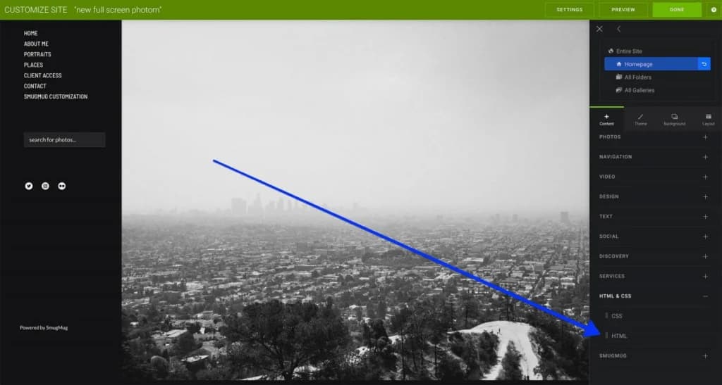
Add the HTML code
In the HTML tab of your content block, paste the following code:
<!-- Full-screen slideshow container -->
<div class="container">
    <div class="progress-bar"></div>
    <div class="slides">

        <div class="slide" style="background-image: url(YOUR_IMAGE_1_URL);"></div>
        <div class="slide" style="background-image: url(YOUR_IMAGE_2_URL);"></div>
        <div class="slide" style="background-image: url(YOUR_IMAGE_3_URL);"></div>
        <div class="slide" style="background-image: url(YOUR_IMAGE_4_URL);"></div>
        <div class="slide" style="background-image: url(YOUR_IMAGE_5_URL);"></div>

    </div>
</div>
Replace YOUR_IMAGE_X_URL with direct links to your SmugMug images.
Get your image URLs
To find direct image links:
- Open your image in SmugMug
- Click the Share button
- Select Image Link
- Copy the URL (choose a large size like X4 or 4K for best quality)
Add the CSS code
Switch to the CSS tab in your HTML content block and paste this code:
html {
    margin: 0;
    padding: 0;
    width: 100%;
    height: 100%;
}

.container {
    position: relative;
    overflow: hidden;
}

.container .slides {
    position: relative;
    height: 100vh;
}

.container .slides .slide {
    position: absolute;
    height: 100vh;
    width: 100%;
    left: 0;
    z-index: 1;
    background-size: cover;
    background-repeat: no-repeat;
    background-position: center center;
}

/* Animation for each slide */
.container .slides .slide:nth-child(1) {
    animation: slide1 25s linear infinite;
}
.container .slides .slide:nth-child(2) {
    animation: slide2 25s linear infinite;
}
.container .slides .slide:nth-child(3) {
    animation: slide3 25s linear infinite;
}
.container .slides .slide:nth-child(4) {
    animation: slide4 25s linear infinite;
}
.container .slides .slide:nth-child(5) {
    animation: slide5 25s linear infinite;
}

/* Slide 1 keyframes */
@keyframes slide1 {
    12% { opacity: 1; z-index: 1; }
    16% { opacity: 0; z-index: 0; }
    17% { opacity: 0; z-index: 0; }
    87% { opacity: 0; z-index: 0; }
    92% { opacity: 0; z-index: 0; }
    100% { z-index: 1; opacity: 1; }
}

/* Slide 2 keyframes */
@keyframes slide2 {
    0% { opacity: 0; z-index: 0; }
    12% { opacity: 0; z-index: 0; }
    16% { opacity: 1; z-index: 1; }
    32% { opacity: 1; z-index: 1; }
    36% { opacity: 0; z-index: 0; }
    100% { opacity: 0; z-index: 0; }
}

/* Slide 3 keyframes */
@keyframes slide3 {
    0% { opacity: 0; z-index: 0; }
    32% { opacity: 0; z-index: 0; }
    36% { opacity: 1; z-index: 1; }
    52% { opacity: 1; z-index: 1; }
    56% { opacity: 0; z-index: 0; }
    100% { opacity: 0; z-index: 0; }
}

/* Slide 4 keyframes */
@keyframes slide4 {
    0% { opacity: 0; z-index: 0; }
    52% { opacity: 0; z-index: 0; }
    56% { opacity: 1; z-index: 1; }
    72% { opacity: 1; z-index: 1; }
    76% { opacity: 0; z-index: 0; }
    100% { opacity: 0; z-index: 0; }
}

/* Slide 5 keyframes */
@keyframes slide5 {
    0% { opacity: 0; z-index: 0; }
    72% { opacity: 0; z-index: 0; }
    76% { opacity: 1; z-index: 1; }
    92% { opacity: 1; z-index: 1; }
    100% { opacity: 0; z-index: 0; }
}

/* Progress bar */
.progress-bar {
    position: absolute;
    top: 0;
    left: 0;
    z-index: 3;
    width: 100%;
    height: 5px;
    background: #0045d4;
    animation: processbar 25s ease infinite;
}

@keyframes processbar {
    0%, 16%, 36%, 56%, 76%, 100% { width: 0%; opacity: 0; }
    0%, 20%, 40%, 60%, 80% { width: 0%; opacity: 0.4; }
    12%, 32%, 52%, 72%, 92% { width: 100%; opacity: 1; }
    13%, 33%, 53%, 73%, 93% { width: 100%; opacity: 0.4; }
    14%, 34%, 54%, 74%, 94% { width: 100%; opacity: 0; }
}

/* Mobile responsiveness */
@media only screen and (max-width: 768px) {
    .container .slides .slide .captions {
        max-width: 90%;
    }
}
Customize and publish
- Change the progress bar color by modifying
background: #0045d4to your preferred color - Remove margins from the HTML content block for a true full-screen effect
- Click Publish to save your changes
Use 5 images for optimal performance. Adding more images increases page load time significantly. You can adjust to 4 or 6 images, but you'll need to modify the keyframe animations accordingly.
Customization options
Change the progress bar color
Find this line in the CSS and change the hex color:
background: #ff6b6b; /* Coral red */
background: #4ecdc4; /* Teal */
background: #f9ca24; /* Yellow */
Adjust slideshow speed
The default cycle is 25 seconds. Change 25s to a different value in all animation declarations:
animation: slide1 30s linear infinite; /* Slower */
animation: slide1 20s linear infinite; /* Faster */
Hide the progress bar
Remove or comment out the .progress-bar section in both HTML and CSS.
Using 4 images instead of 5
Remove the fifth slide from HTML and adjust the keyframe timing to divide 100% by 4 instead of 5.
Tips for best results
- Use horizontal images — Vertical images will be heavily cropped
- Keep subjects centered — Edges may be cropped on some screen sizes
- Choose consistent images — Similar lighting and style creates a cohesive feel
- Use high-resolution images — Select X4 or 4K sizes for sharp display on large screens
How to Change Buy Button Labels on SmugMug
Customize the text on SmugMug's buy buttons using CSS. Replace "Buy Photos" or "Buy Photo Package" with your own labels like "Shop Now" or "Buy Digital Package".
Why Images Look Cropped in SmugMug's Full-Screen Slideshow
Understand why SmugMug crops images in full-screen slideshows and learn best practices for selecting images that display well.